Responsive web design (RWD) is a web design approach aimed at crafting sites to provide an optimal viewing experience—easy reading and navigation with a minimum of resizing, panning, and scrolling—across a wide range of devices (from mobile phones to desktop computer monitors).
Almost every new client these days wants a mobile version of their website. It’s practically essential after all: one design for the Android, another for the iPhone, the iPad, netbook, Kindle — and all screen resolutions must be compatible, too. In the next five years, we’ll likely need to design for a number of additional inventions. When will the madness stop? It won’t, of course.
In the field of Web design and development, we’re quickly getting to the point of being unable to keep up with the endless new resolutions and devices. For many websites, creating a website version for each resolution and new device would be impossible, or at least impractical. Should we just suffer the consequences of losing visitors from one device, for the benefit of gaining visitors from another? Or is there another option?
Responsive Web design is the approach that suggests that design and development should respond to the user’s behavior and environment based on screen size, platform and orientation. The practice consists of a mix of flexible grids and layouts, images and an intelligent use of CSS media queries. As the user switches from their laptop to iPad, the website should automatically switch to accommodate for resolution, image size and scripting abilities. In other words, the website should have the technology to automatically respond to the user’s preferences. This would eliminate the need for a different design and development phase for each new gadget on the market.
sample Web design that features this better flexible layout:
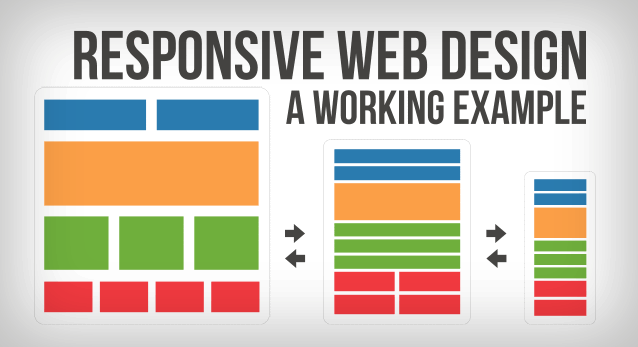
A few years ago, when flexible layouts were almost a “luxury” for websites, the only things that were flexible in a design were the layout columns (structural elements) and the text. Images could easily break layouts, and even flexible structural elements broke a layout’s form when pushed enough. Flexible designs weren’t really that flexible; they could give or take a few hundred pixels, but they often couldn’t adjust from a large computer screen to a netbook.
Now we can make things more flexible. Images can be automatically adjusted, and we have workarounds so that layouts never break (although they may become squished and illegible in the process). While it’s not a complete fix, the solution gives us far more options. It’s perfect for devices that switch from portrait orientation to landscape in an instant or for when users switch from a large computer screen to an iPad.
Core Concepts
Three key technical features are the heart of responsive Web design:
- Media queries and media query listeners
- A flexible grid-based layout that uses relative sizing
- Flexible images and media, through dynamic resizing or CSS
Truly responsive Web design requires all three features to be implemented.
The key point is adapting to the user’s needs and device capabilities. Suppose a mobile user will be viewing your site on a small screen. Taking the user’s needs into account doesn’t just mean adapting your content to the screen size. It also means thinking about what that mobile user will require first when visiting your site and then laying out the content accordingly. Maybe you’ll present the information in a different order. Don’t assume the user won’t need access to all the site information because she’s on a mobile device. You might need to change the fonts or interaction areas to respond better to a touch environment. All these factors influence responsive Web design.
While mobile devices are changing the display landscape, with the appearance of more and more small screens, don’t forget what’s happening at the other end of the spectrum. Displays are also getting larger and larger. Having to serve both segments shouldn’t stop designers from being innovative on either.